
Max Frost: Withdrawal
Description: Withdrawal was a research and development project with the goal of discovering best practices for incorporating Microsoft’s volumetric performance capture tech into VR music experiences. As the title suggests, our team used performance capture of Max Frost playing his song, Withdrawal to take users on a journey in which they escape from the doldrums of daily life and travel through increasingly trippy, psychedelic environments.
Platforms: HTC Vive, Windows Mixed Reality Headsets
Team: 6-person team
Type: Professional Project (Viacom NEXT)
Role: Designer
Core Responsibilities: Level Design/ Environment Art
Tools: Unity, Maya
This project was not released to the public. In 2017, it was demoed at Microsoft’s Build conference in Seattle, then turned in to Viacom as a proof of concept for potential future VR experiences.
Videos
Teaser
Full Experience
Design
Visual Composition
Because players have free reign to turn their heads and look where they please, I used visual composition techniques to create pleasing compositions and subtly guide players’ gazes toward the most interesting elements of the level. Below are a couple of examples:
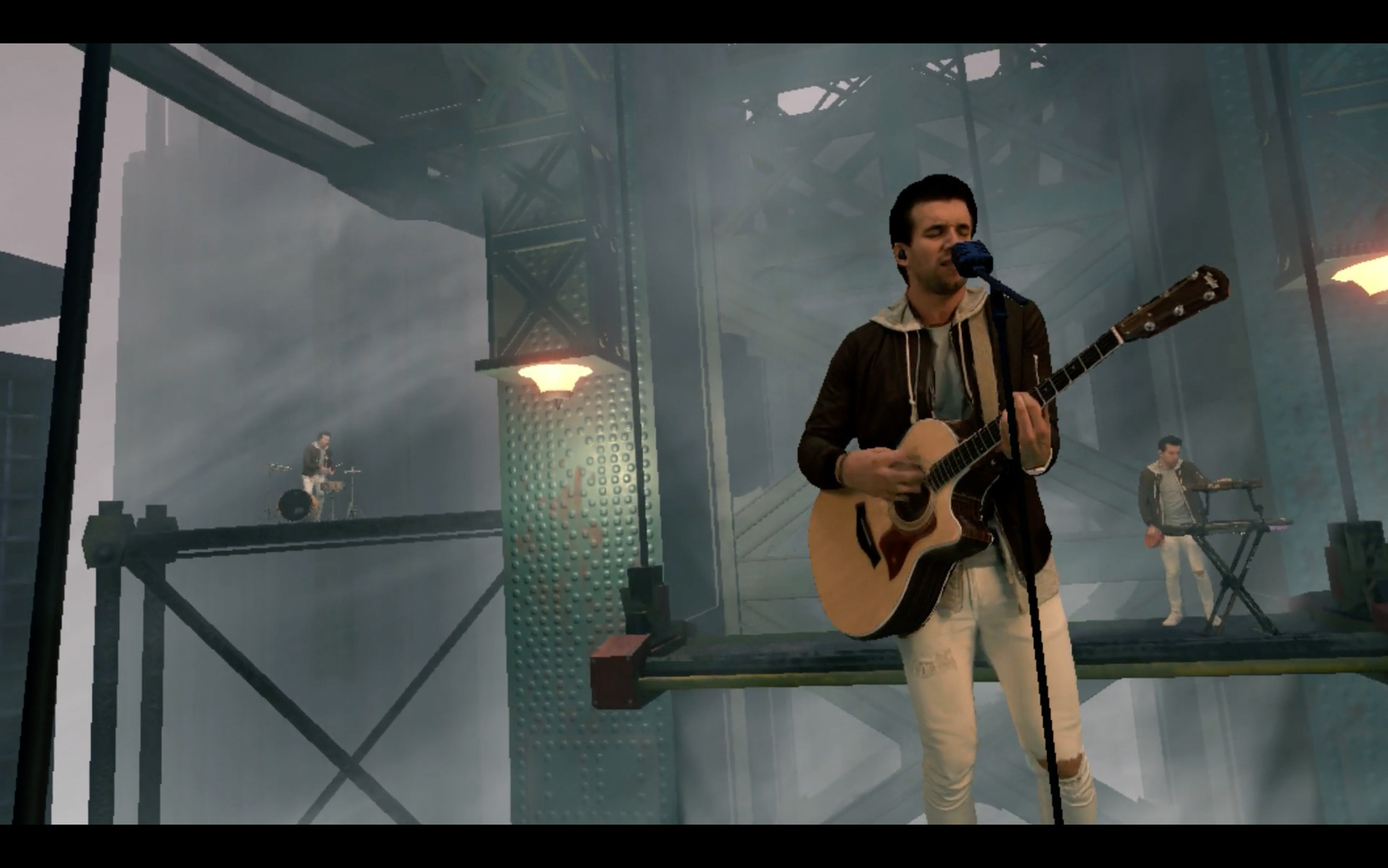
Leading lines and Balanced Composition: Here, I did my best to place characters and props in a way that provides equal visual weight on both sides of the composition. I also used the placement of the long, rectangular girders to guide the player’s eye around the composition in a way the leads their gaze to all 4 characters in this section.
Framing- Here we used the structure of the bridge (red overlay), the kelp strands (green overlay), and various girders and other metal elements (arrows) to frame Max. We found that framing is usually considered to be a visually pleasing way to depict a subject and is a good way to draw players’ eyes toward what you want them to see.
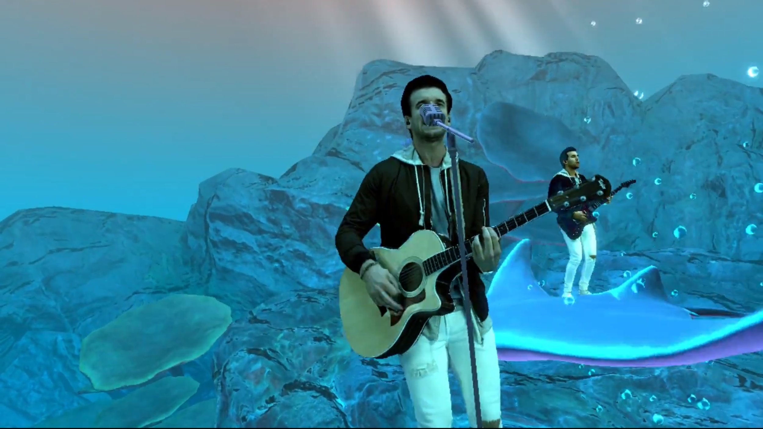
Movement- Players’ eyes will focus more readily on moving objects than static elements of the environment. We used the swimming manta rays in the underwater portion of our level to draw attention and create visual interest.
Pacing
We used the concept of the interest curve as a tool to plan the pacing of our experience. The interest curve is a concept described in Chapter 16 of Jesse Schell’s book, The Art of Game Design.
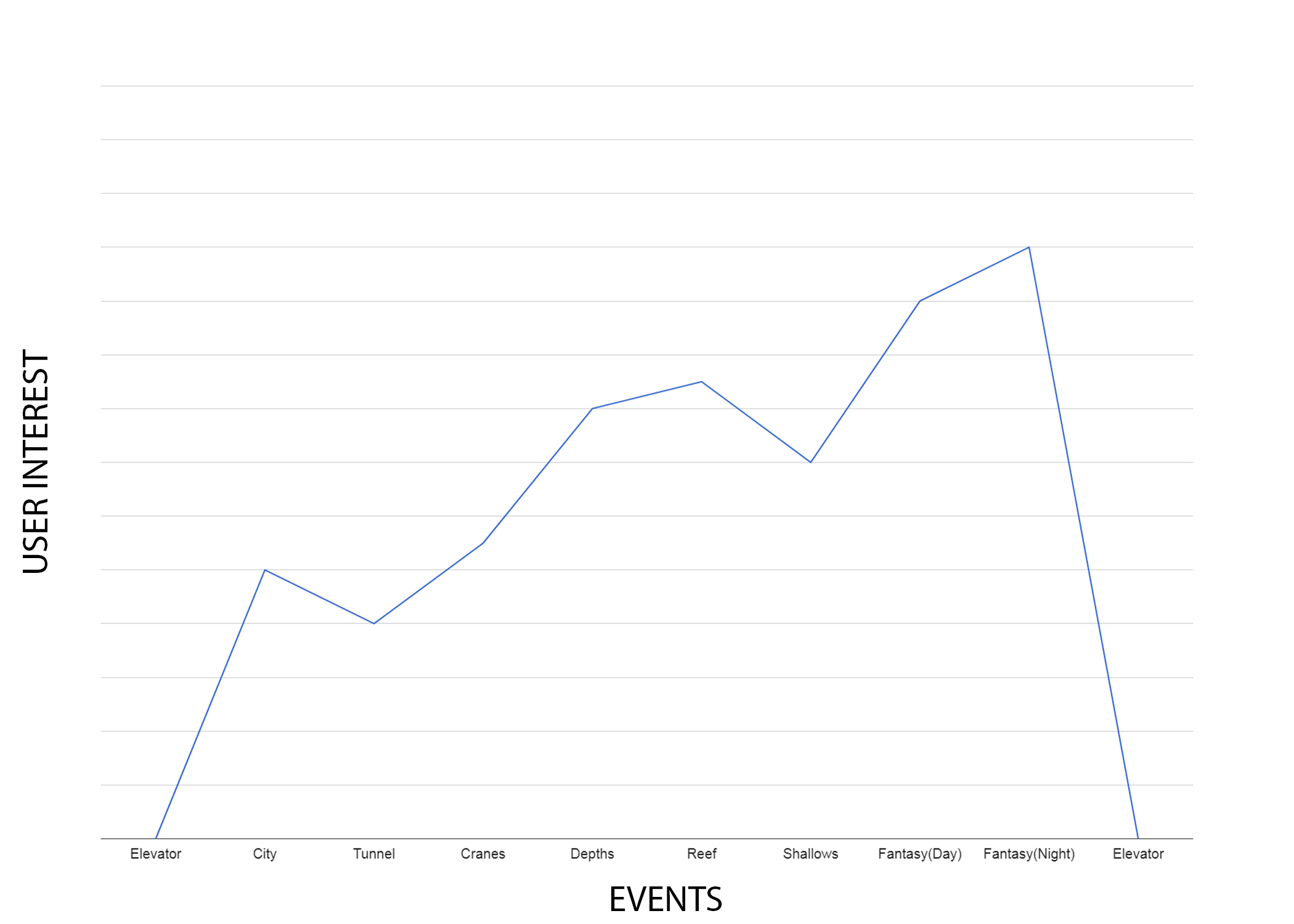
To summarize the idea, the interest curve is a pacing structure in which events become steadily more interesting/exciting as the the experience progresses. However, the user needs moments of respite between these major events or else the experience will overstimulate and become numbing. The ideal interest curve graph trends upwards (before heading downward at the end as the experience resolves), yet features small valleys along the way to allow users to catch their breath and to give the big moments more punch.
Below is a video from the Extra Credits Youtube channel that does a pretty good job of explaining this concept in more detail.
Withdrawal’s Interest Curve
Event Breakdown
Elevator
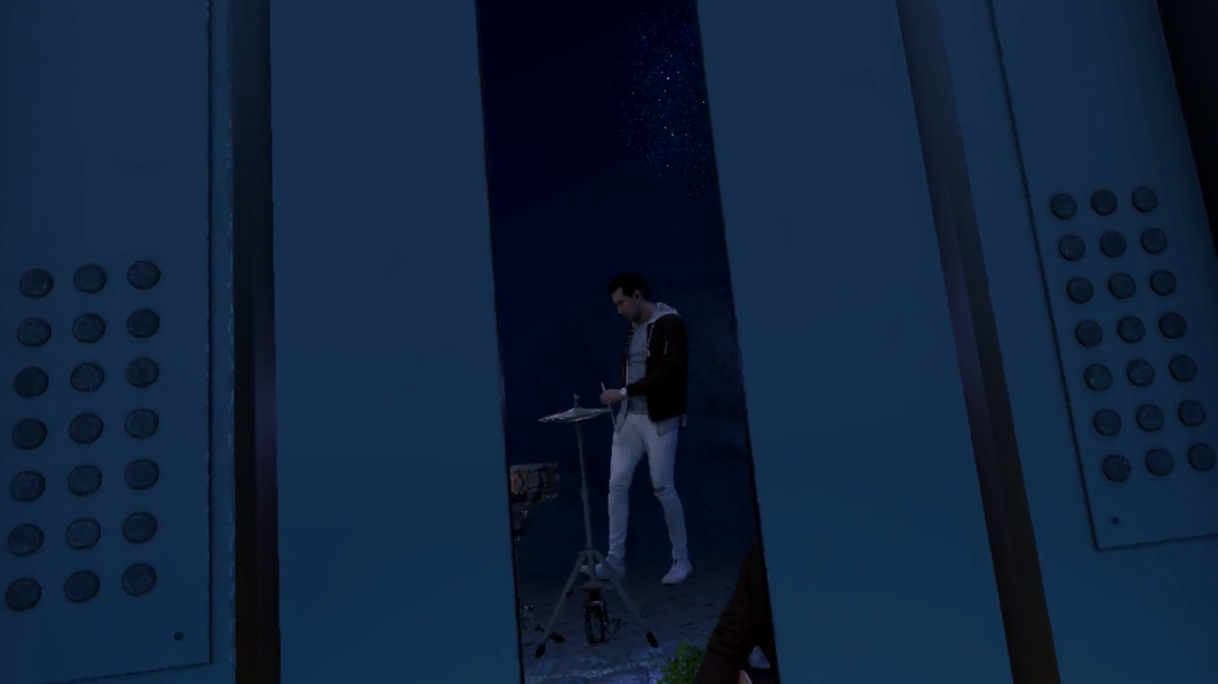
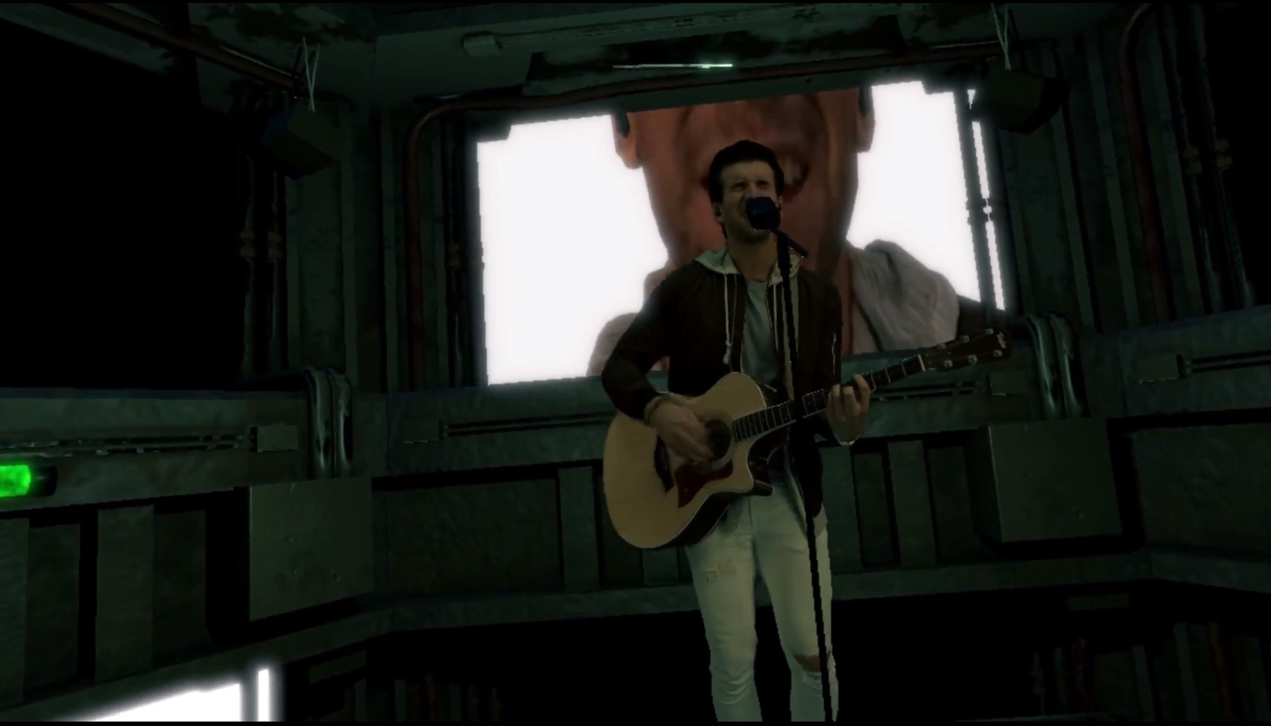
The experience begins in a small, dark elevator with a monitor in the corner displaying Max frost. After the intro of the song, the elevator walls and doors fall apart.
We intentionally start the user in a cramped, and mundane environment. Low point of the interest curve.
City
After the elevator falls apart, the user finds themselves in a foggy, urban environment. The user sees multiple Maxes on girders playing various instruments to the song
The interest curve sees a big spike here. The size of this environment contrasts with the tiny elevator, in addition to the novelty of seeing multiple performance-captured Max’s.
Tunnel
After moving through the city, the user enters a tunnel surrounded by screens showing Max. This is a transitional environment.
While this environment introduces a fresh gimmick by surrounding the user with screens, the tunnel represents a small interest curve dip. It’s a darker, more enclosed environment with just a single Max Frost model.
Cranes
Following the tunnel, the user finds themselves above the rooftops of the city, surrounded by multiple Max Frosts rising with the user via pulleys.
This scene represents a spike in the interest curve. The multiple Maxes rising with the user creates more visual interest than previous environments.
Ocean Depths
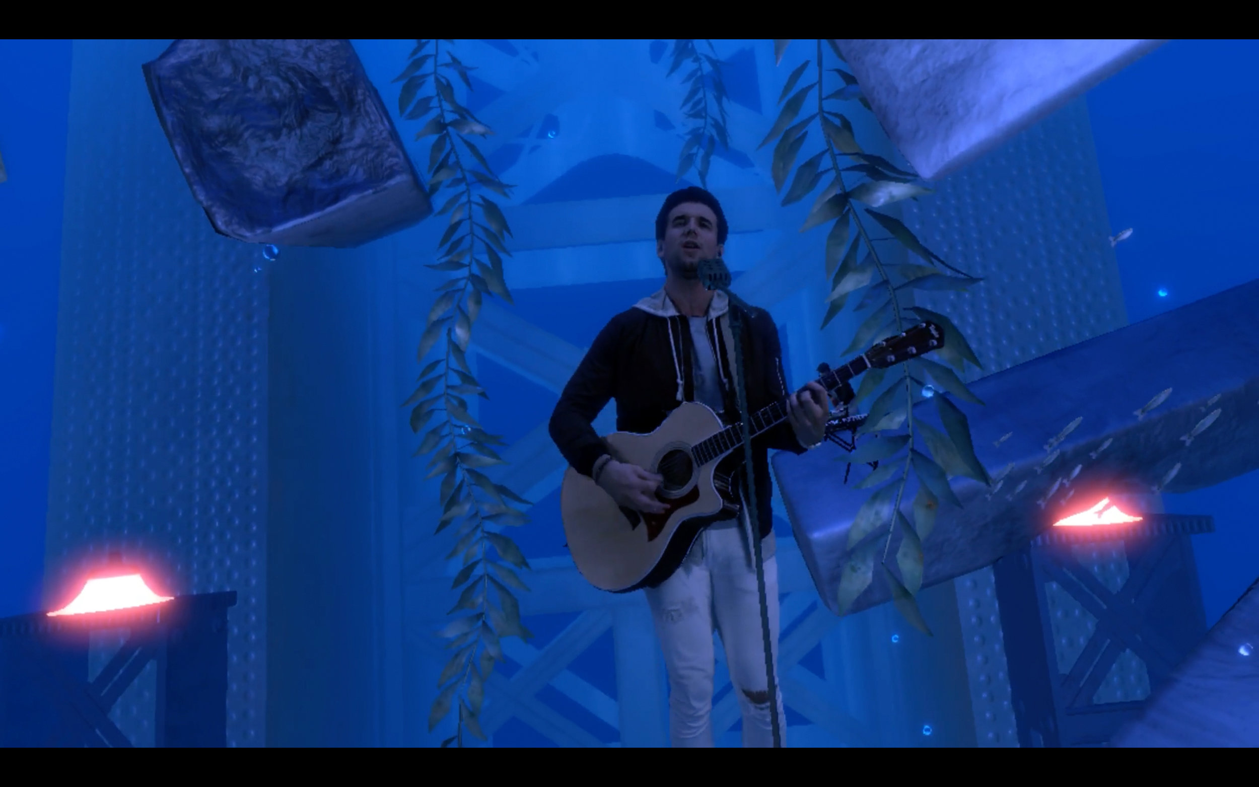
Next, the user enters the upside down ocean. The first stage of the ocean is dark and filled with rusted metal debris.
From an interest curve standpoint, our interest curve continues to climb. This area provides contrast from the previous one. It is very dense and claustrophobic. The environment encroaches on the player’s space with the intention of making them feel slightly uncomfortable. This space is meant to feel precarious and unsafe.
Coral Reef
Next, the user emerges from the depths to a sun-filled coral reef. Max Frosts riding manta rays surround the user. When someone on the team came up with the idea for the manta ray surfing, we thought it was hilarious and had to include it.
This part of the level was meant to contrast with the previous. This is the first part of the level that’s bright and happy in tone, and also features more movement than the static, previous area.
Shallows
Following the coral reef, there’s a respite as the player nears the surface of the ocean.
This represents dip in the interest curve as we move toward the climax
Fantasy World (Sunset)
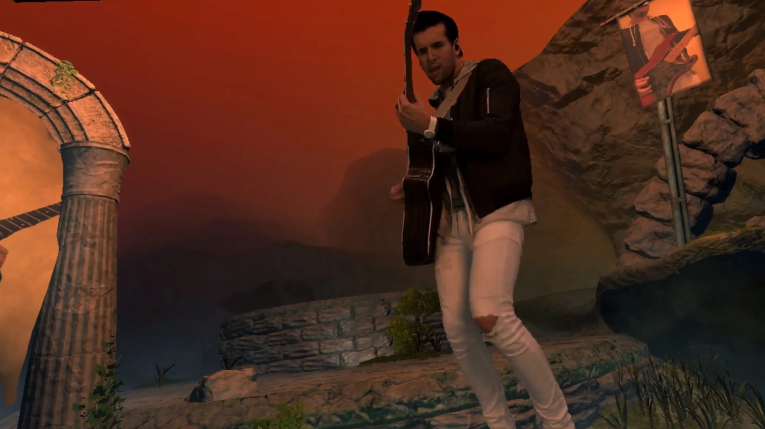
After rising out of the ocean, the user finds themselves in a fantasy world, loosely inspired by ancient Greek architecture with a giant Max, inspired by the Colossus of Rhodes.
This area represents another interest curve spike as the player enters the grand finale.
Fantasy World (Night)
As the user continues to move upward, the sun sets, several other giant Max’s appear and fireworks begin to go off around the user.
This is the climax of the experience and the highest point on the interest curve.
Elevator (Again)
At the end of their journey, the player is jolted out of the fantasy world and back to the elevator starting environment.
This is the conclusion of the experience, a drop in the interest curve as the user transitions from psychedelic to the dull and ordinary.


