
North Park [Left 4 Dead 2 Campaign Mod]
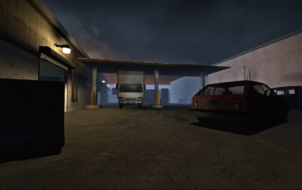
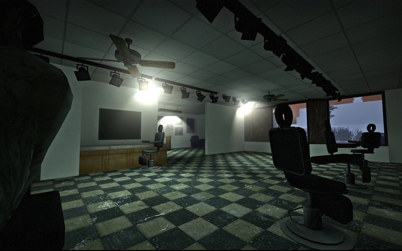
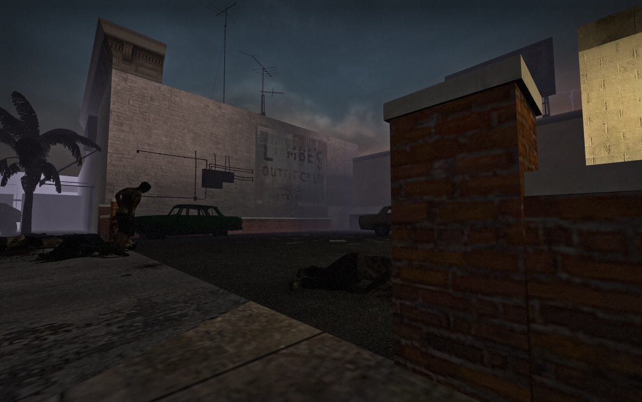
Description: North Park is a campaign designed for Left 4 Dead 2. The mod takes players through the zombie-infested streets of a southern California city. Although the city was fortified during an apparent military occupation, it’s clear that the barriers weren’t enough to hold off the growing zombie infestation.
In act of desperation, Players traverse the commercial and residential districts of the city, navigating mazes of barbed wire, sinkholes, and boarded-up buildings, all well fending off the undead threat in a bid to reach the last remaining safe house in the area.
Team: none (solo project)
Type: Personal Project
Role: Level Designer
Core Responsibilities: Level Design
Tools: Source Engine/ Valve Hammer Editor
Available for download on Steam
Gameplay Video
Level Design Analysis
Space 1- Bar/ Laundromat Building
Partway through the level, the player must navigate around, through, and above a commercial building housing a bar and a laundromat.
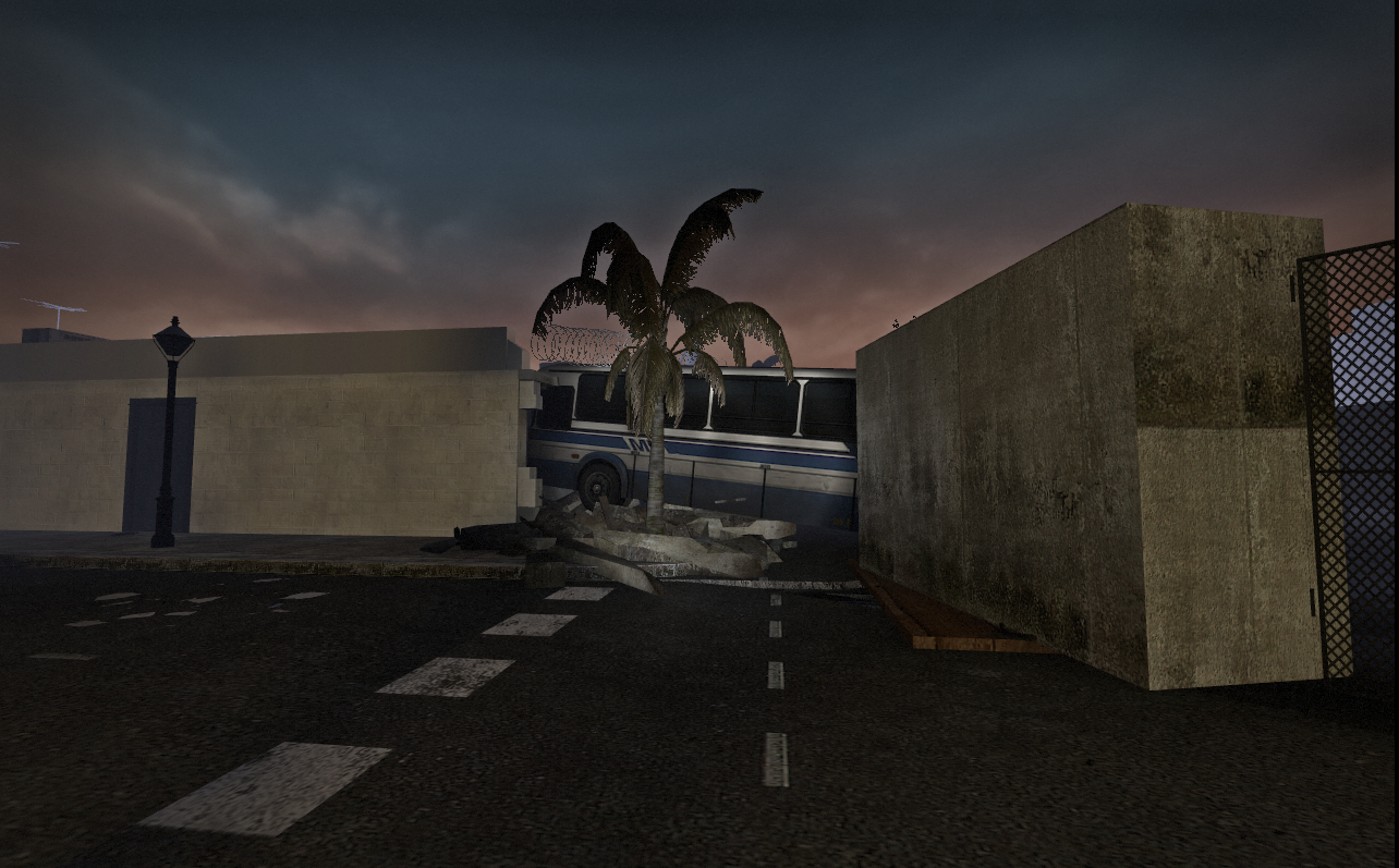
When the player first encounters this space, they are traveling along a road, only to encounter a major obstacle preventing further progression, a bus that has crashed into a building. To the right of the bus is a large section of collapsed road that has been blocked off with fences and concrete.
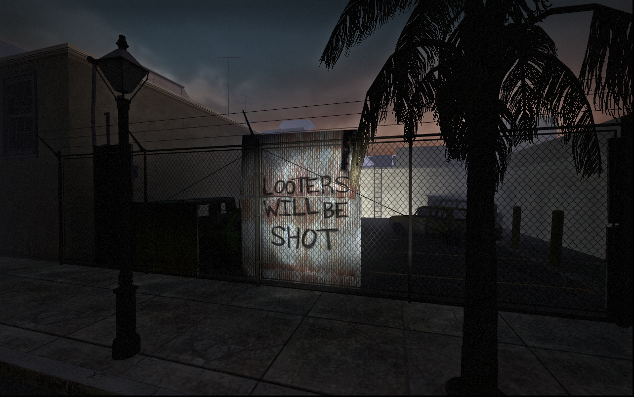
To the left of the bus, the user can see a parking area through a fence with a ladder conspicuously lit with car headlights. This is the means to further progression through the level, but the user can’t reach their goal through the most obvious, direct route.
This moment constitutes a denial. Designer Tom Pugh describes the denials in his “Level Design Tips and Tricks” Gamasutra post, by writing “[Denials] can be used for progression in level design to enhance a player’s sense of progression. Give players a view of their objective, send them on a route where they can no longer see it, and then emerge them closer to the objective with a new angle of visibility.”
Progression/ Flow
Below is a 2 pt. look at how the player actually navigates this space. My design goals here were to make the most of space, including taking advantage of the Z-axis, guide the player through a familiar type of structure in an unusual and unexpected way, and use Valve’s design concept of loops (or leading the player away from a location and then back to that location in an essentially linear path.
Valve states that the benefits of using a loop are Illusion of Choice, Immersion, smart usage of Resources and player Guidance. More detailed documentation about loops can be viewed here.
Below, I’ve broken down the progression through this space into a list of events:
The player enters the structure through a side door and moves through a side hallway/bathroom area of the laundromat.
Then they exit the building through a hole in the wall created by the crashed bus.
After exiting, they progress down the street and make a left turn into a delivery loading area fulled with trucks.
Then they enter the kitchen of the bar, move through the bar, then enter the laundromat for a second time through a damaged wall.
They exit out the back of the laundromat, traverse a small storage/ office area and find themselves in the parking area that they saw before entering the structure.
After exiting the building, the player climbs a fire ladder attached to the wall and climbs on the roof.
The player then navigates around some air conditioners and vents on the rooftop that occlude their view.
Then they use the bus that originally blocked their path as a bridge to the next area a sink hole in the road, going from a point of high elevation to one of the lowest points on the map.
Combat Space Design
L4D’s mechanics encourage specific types of spaces
Left 4 Dead is somewhat unusual for the shooter genre in the sense that there are no enemies that use hit-scan weapons. The Common Infected (who comprise the bulk of the enemies that the player encounters) are entirely melee-based, while the Special Infected employ a combination of melee and projectile attacks.
In terms of gameplay, this discourages the player from camping behind a single piece of cover and slowly picking off enemies. Because the player is constantly being swarmed by groups of melee enemies, they are encouraged by the game’s mechanics to constantly be on the move, flowing around the combat spaces with the intent of keeping distance and obstacles between themselves and the enemies.
Micro-Loops
As stated in the previous section, the overall design of this building is a loop, but I also built smaller, “micro-loops” into each individual area of the space. The intent of these micro-loops is to allow the player the move continuously, giving them the opportunity to kite enemies and keep a safe distance between them.
When paired with enemies, dead ends break the flow and create situations that trap the player, putting them at a disadvantage. While dead ends can create tension for those reasons, I did my best to use them sparingly in the design of this level.
Below I’ve illustrated a few of the loops in the bar/laundromat building:
Using narrow space effectively
As I mentioned above, dead ends (and narrow passageways overall) are risky for players in L4D. These space allow swarms of zombies to trap players, leaving them with few options other than to try to make forward progress and blast their way out of the situation. In his article, “Designing Better Levels Through Human Survival Instincts” designer Christopher Totten defines narrow space as, “A small enclosed space where the occupant feels confined and unable to move. These spaces create a sense of vulnerability in the player's inability to properly defend themselves.”
I believe that, when used sparingly, narrow space can be effective in raising the the player’s sense of tension. This is especially useful in a game like Left 4 Dead that employs some of the trappings of the horror genre.
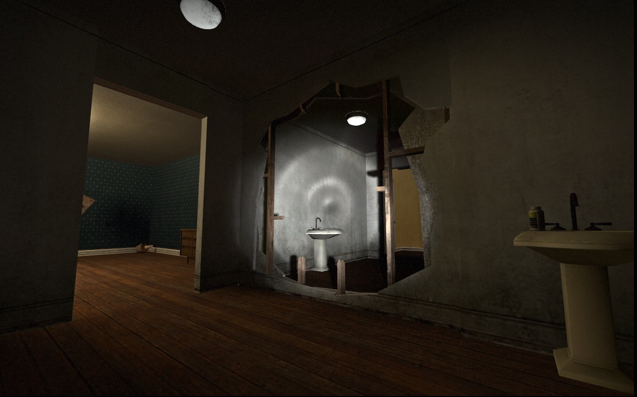
Below is an example of a narrow space in a bathroom found in the bar area. It’s small, dark, and tucked away in the corner of the level (easily-missed by players blitzing through the level), but contains powerful weaponry for those that find it and are willing to take the take the risk of venturing into the space.
Analysis of Bar Area
Sycamore Den also has a decent craft beer selection and free popcorn.
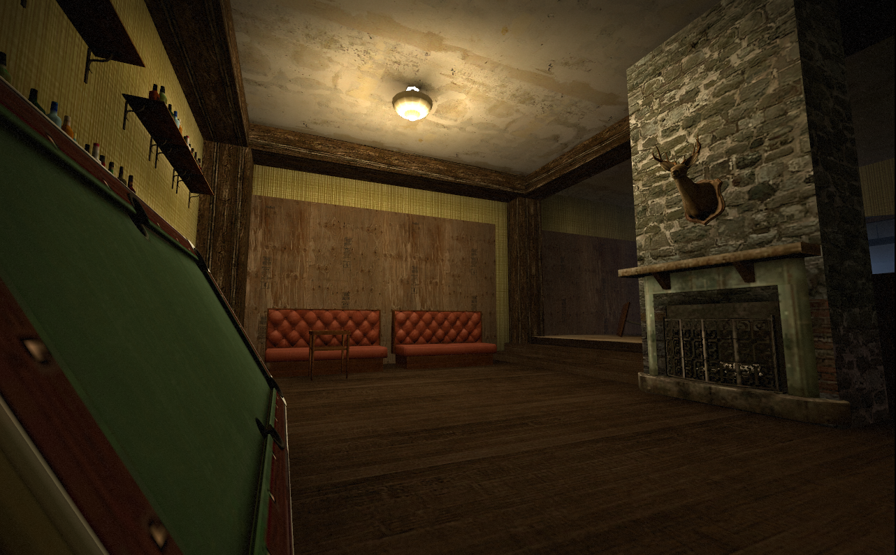
The aesthetics of the bar area were inspired by a bar in the San Diego area called Sycamore Den. I liked the rustic aesthetic and the sunken sitting area and did my best to incorporate those elements of this space into my level.
I used the bar on the right side of the image as well as the large, vertical, wood beams to subside the space into several, smaller connected areas. The sunken area with the pool table acts as a an area that the player can retreat to as it has 2 distinct entrances/exits for the player to watch and 2 backboard walls.
In her class, “Level Design for Games”, Naughty Dog lead designer, Emilia Schatz, defines a backboard as a solid wall that is impenetrable to both players and enemies. The backboard wall is an ally to the player in combat because they can turn their back from it and be confident that no threats can approach them from behind. Backboards are a means for the player to control their environment and mitigate threats.
The stone fireplace in the center of the room acts as an occluder, breaking up the player’s line of sight, obscuring enemies and making it more difficult for the player to line up shots. It is also the defining aesthetic element of this particular space.
Space 2- Suburban Street
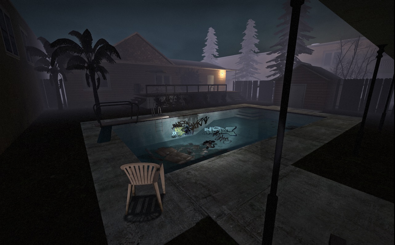
This suburban street environment represents a fairly open-ended combat environment that makes use of Christopher Totten’s refuge/prospect space concept. In his “Designing Better Levels Through Human Survival Instincts” article, Totten defines refuge and prospect by writing “ Refuges are places like caves and tree covered areas where early humans could look out into the Prospect spaces of wilderness and evaluate potential threats.”
Image taken from Christopher Totten’s “Designing Better Levels Through Human Survival Instincts”
Totten then explores the relationship between refuge, prospect and secondary refuge.
A level that makes use of multiple refuges with expanses of prospect space in-between, creates a situation in which the player begins in a position of safety, must venture into danger in a journey to seek another area of safety on the way to their goal.
Level Analysis
The player enters this suburban street area from the bottom-right of this image. They have the option to keep right and stay underneath the apartment building’s overhang in the parking area or move left into the open. The garage represents a refuge space. They can also move into the prospect space to the right to enter the house through one of several entrances.
The house’s 4 main walls consist of screens. Screens are a concept defined by Emilia Schatz in her “Level Design for Games” class. Screens are porous walls (as opposed to solid backboards.) that afford players and enemies the ability to move and shoot through them. Because the outer walls provide movement opportunities, the house provides players with a respite from the open prospect space that surrounds it, but they must remain on guard and several different directions from which enemies can approach.
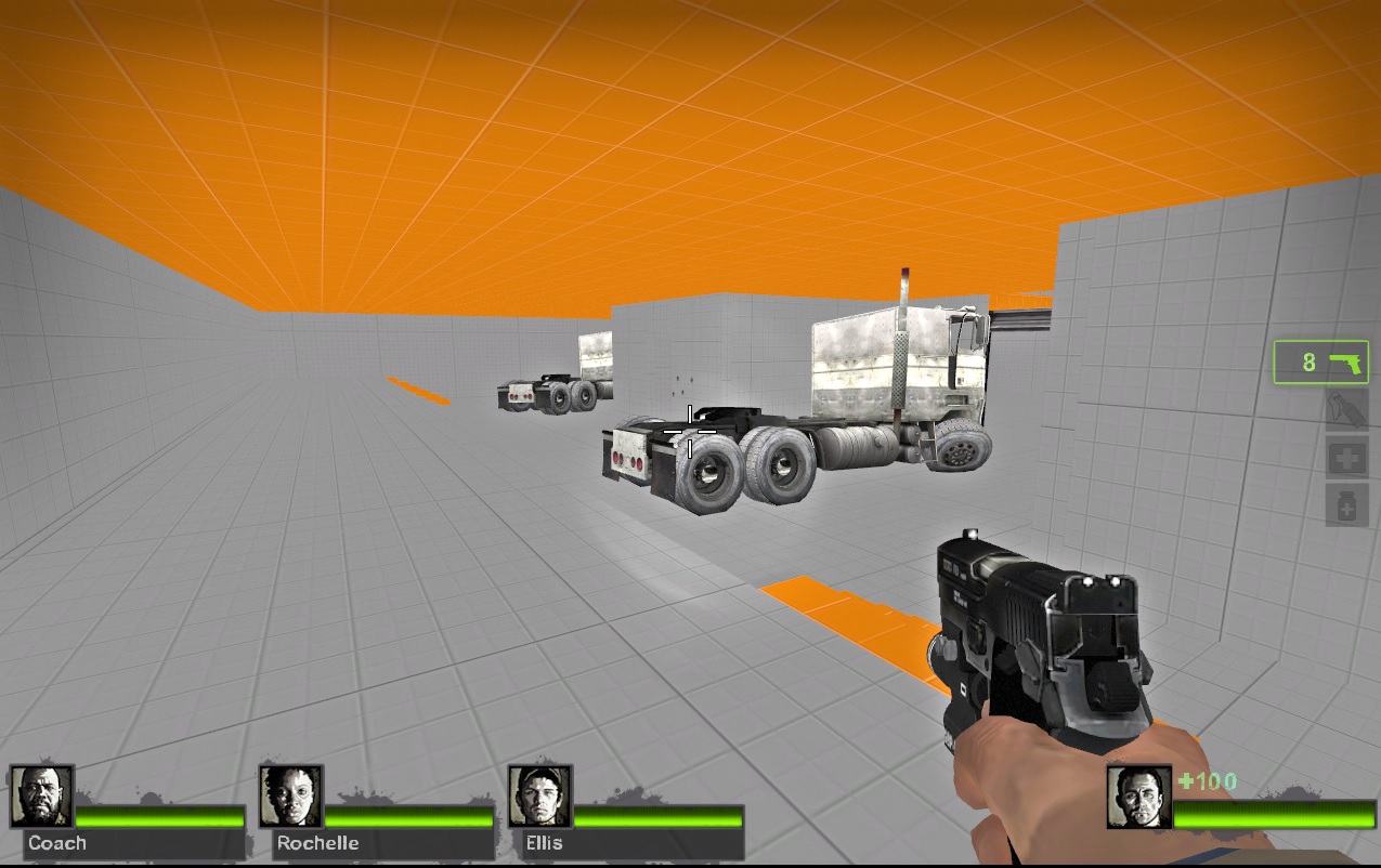
This area also features a tertiary refuges space beyond the house. Players can jump up on the crashed trucks to elevate themselves above the prospect space. The player is safer here than in the open prospect space and gain control over their environment from this point of elevation. This refuge also isn’t completely safe however. Enemies can use one of several “infected-only” ladders to climb onto the trucks and force players back into prospect space.
Below is a diagram outlining the area’s prospect and refuge spaces as well as the various entrances to the house and the means through which players enter and exit this space.
Affordances and Denial of Afforances
From the elevated position of the tertiary refuge area, the players also have a direct sight-line to several gas tanks which they can shoot to more quickly and easily dispatch enemies in the area.
An affordance is defined as the relationship between the perceived and actual properties of an object. In this level, I used this idea to guide players toward their goal.
Here’s an example in which a board hanging off the edge of a building is used to suggest to players that they should jump off this roof to the adjacent balcony. This section of the level is taken from the finale in which players must run from a horde of aggressive zombies to the safe room.
Clearly affording player movement was especially important in this area as players are under heavy pressure and don’t have much time to think on their feet.
I also considered denial of affordance. To clearly denote doors, windows, and paths, as not part of the navigable area, I used boards and other barriers to block them off.
Without this consideration, players would frequently attempt to open doors that aren’t actually part of the level space, and merely exist for aesthetic purposes. The denial of affordances allows players to move through the space with confidence.
This concept is explained clearly in game designer David Shaver’s portion of the GDC talk, “Blockmesh and Lighting Tips.”
